It's a critical part of your membership site and key to member satisfaction and retention! Discover how to create a personalized member dashboard for a seamless and engaging member experience on your site.
Contents
Imagine logging into a platform and immediately finding everything you need, right at your fingertips. It's a great strategy for boosting member engagement and retention on your membership site. Your Member Dashboard page is a powerful tool that can transform the member experience from ‘meh' to ‘marvelous.'
But what if you could go a step further? What if you could offer a personalized dashboard that feels like it was crafted just for each member?
That's where WishList Member's Dashboard comes into play. Acting as a fully customizable dashboard, it offers you the chance to deliver an unparalleled, tailor-made experience for every user, every time they log in.
Intrigued? Stick around. In this comprehensive guide, you'll discover how to make the most of the Member Dashboard page to create a captivating dashboard that exceeds your members' expectations.
Let's dash to it!
Creating a Member Dashboard Page
Why Does Your Member Dashboard Page Matter?
Your Member Dashboard is more than just a ‘nice-to-have.' It's an absolute game-changer for both you and your members.
Here's why:
Improved User Experience
Who doesn't love an easy-peasy interface? A dashboard takes the headache out of navigating your site.
All the essentials – account settings, special articles, you name it – are right at their fingertips. Which leads to…
Increased Engagement
When people find it easy to use your site, they tend to use it more. It makes them want to dig deeper. Remove the frustrations, and they'll spend more time clicking, exploring, and interacting with your content. And the more they do, the more they feel like a part of your community.
Reduced Support Costs
Dashboards are also money-savers. Think of it as a ‘DIY Help Desk' where members find what they need without calling for backup.
This frees up time for your support team, so they can focus on the big issues. Fewer hours spent on support = more time to grow your community!

Improved Retention
Keeping your members is important. After all, retention is between five-seven times cheaper than acquisition.
A great dashboard adds value to their experience and gives them more reasons to stick around. When renewal time comes, they're more likely to stay if they find your site helpful and engaging.
Using our Member Dashboard After Login page, you can create a dashboard that's custom-fit for each membership level. This boosts member satisfaction and sets your site apart.
The Role of WishList Member's After Login Page
The After Login Page is like your site's personal greeter. It's the first thing your members will see each time they log in. You want to make that ‘hello' count, right?
Here, you can flex your creative muscles and tailor the page to give your members a snazzier dashboard experience. Add quick links, important messages, or that secret sauce that makes your community unique.
After Login Page Overview
And don't think it's one-size-fits-all; that’s not how we roll. You can set a Global Default After Login page or – even better – craft individual pages for different membership levels.
High-rolling VIP members? Give them the five-star treatment! Newbies? Guide them through their first steps in your community. The choice is all yours!
For more in-depth details on settings and configurations, we’ve got a whole article dedicated to just that. But for now, we’re zeroing in on how you can turn this After Login Page into a dynamo Member Dashboard.
Essential Elements for a Highly Effective Member Dashboard Page

What elements should you focus on to make sure it's not just functional but also member-friendly? Let's jump right into the key components you'll want to include.
Clear Links
We're talking about those crucial buttons or links that guide your members to their next adventure on your site. You know, that direct route to the latest webinar, the coolest forum discussion, or even the new merchandise shop.
Make those links crystal clear and easy to find. No one likes playing “Where's Waldo?” when they're looking for essential resources.
Account Area
Members should be able to update their profile, switch out that two-year-old profile picture, change their password, and manage their email settings all without needing a decoder ring.
Ensure that the account area is straightforward, easy-to-navigate, and offers everything they need to keep their membership details up-to-date.
Any Provided Extras
Have some bonus content like ebooks, exclusive videos, or special webinars? Don’t hide those goodies. Give them a spotlight on the dashboard. Trust us, your members will appreciate the extra value you’re packing into their experience.
Access to Support
Say a member can't access a feature or forgets how to find something. They'll need immediate help, and you want to be there for them.
Insert quick links to customer service, FAQs, or even live chat support. Make solving problems a breeze, and you'll have members singing your praises.
Personalizing Dashboards Based on Membership Level
One-size-fits-all might work for some things, but when it comes to member dashboards, personalization is key.
Especially if you're running a site with different membership tiers, you'll want to greet each member with an After Login page that's relevant to their level. So, let's look into how to customize these experiences using WishList Member.
Setting Up Custom Redirects
Alright, you've got a basic After Login page that serves all your members, and that's a great start! But you've got different membership levels, and they all deserve their special welcome.
With WishList Member, you can set different After Login pages based on membership levels, and it's not even complicated.
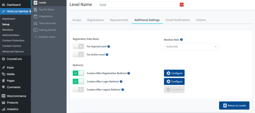
- Head to the WishList Member menu, then click on Setup.
- Find the membership level you want to customize and click on it.
- Click on the Additional Settings tab.
- You'll spot options for Custom After Registration Redirect and Custom After Logout Redirect. Toggle the option you wish to customize and a Configure button will appear.
- Click on Configure and add your desired custom message.

And just like that, you're on your way to delivering a highly personalized member experience. You can direct your high-tier members to exclusive content or your mid-tier members to a selection of educational resources. It's all up to you.
Pro Tip: Need to make sure your redirects are flawless?
Mastering WordPress redirects with WishList Member can be a game-changer for boosting engagement and loyalty. Get started by reading our guide: “How to Master WordPress Redirect Pages with WishList Member.“
The Best Practices & Common Pitfalls of Crafting the Ultimate Member Dashboard
By now, you should be well on your way to creating an amazing member dashboard. But, wait up! There are some super important dos and don'ts to keep in mind to make sure you really hit the mark.
Smart Moves for a Stellar Dashboard

- Make it Look Good: An eye-catching dashboard is a joy to use. Go for high-quality graphics and a polished look.
- Embrace the White Space: Like pauses in a conversation, white space can make all the difference. It helps your members easily find what they're looking for.
- Direct and Doable Calls-to-Action: Be explicit about what steps you want members to take. A button that says “Update Account Info” is way better than something vague like “Go Here.”
- Thumbs Up for Mobile Users: With people logging in from their smartphones, making your dashboard mobile-friendly isn't optional; it's a must.
Mistakes to Steer Clear Of

- Misreading User Needs: Listen, a dashboard isn't about showing off how much information you can cram into one page. It's about what your members need. So, spend some time understanding what resources and features they're actually interested in.
- Information Overload: A dashboard packed with too much stuff is like a messy bedroom – overwhelming and stressful. Keep things streamlined, focusing on what's most essential for the member.
- Jargon Jumble: Technical language or jargon just adds a layer of fuzziness. Stick to words that anyone can understand, especially when labeling buttons or calls-to-action.
- Style Whiplash: Keep your dashboard visually in line with your overall site. Consistency isn't boring; it makes things comfy and familiar.
- Skipping the Test Drive: Before the big launch, get some of your members to take the dashboard for a spin. Collect feedback to smooth out any bumps in the road.
Sooo… What happens next?
Nailing your Member Dashboard and After Login Page is awesome, but guess what? WishList Member doesn't stop there. Let's dig into some other awesome features that'll make managing your community easier and frankly way more fun.
Get to Know Your Members Better
Who is signing up for your salsa dancing course or your mystery book club? Find out by using custom registration forms, and ask some fun questions to get to know the fabulous folk joining your community.
And oh, all that precious info? Safeguarded, thanks to GDPR compliance. Rest easy knowing you're doing right by your members and the law.
Keep Your Members Engaged through Email Notifications
Email notifications aren't just a nice touch; they're a way to keep your community engaged and informed. From new content alerts to membership renewals, keep your members in the know.
WishList Member integrates seamlessly with popular email service providers and third party CRMS so you can send targeted, relevant emails out to your members.
And remember, you're the boss here – you set the permissions and decide who sees what.
Your All-Seeing Admin Dashboard

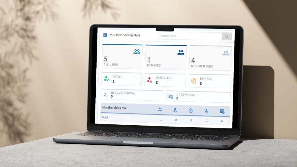
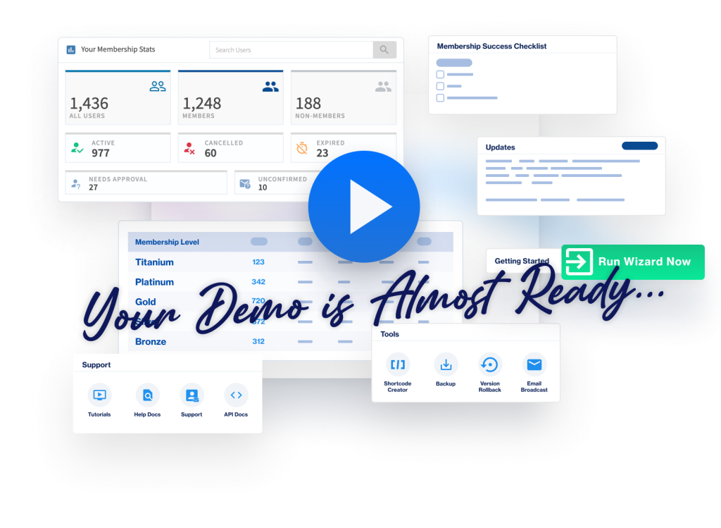
You wouldn't drive without a speedometer, would you? The admin dashboard gives you a panoramic view of all the action.
Real-time stats are just a click away, giving you insights into membership trends, content popularity, and more.
Quick & Easy Course Creation with CourseCure
Online courses can be a game-changer for your membership site. CourseCure makes it a breeze to get your courses up and running.
No tech wizardry needed – just a few simple steps and you're good to go! Add quizzes, interactive content, and even gamification elements to keep your learners hooked till the very end.
Conclusion
A well-designed member dashboard can truly be the heart of your membership site, making members feel at home while giving them quick access to all the good stuff. With WishList Member, crafting this crucial page is easier than tying your shoes.
Well-organized links, user-friendly settings, and a whole bunch of personalization options make it the go-to tool for boosting member satisfaction and engagement.
So get started with WishList Member today and you'll be able to confidently control your members' experience on your site. WishList Member is designed to make it easy to customize and configure your site to your exact needs. And if you need help along the way, our customer success team is on hand to help you make the most of our extensive features.
Got any questions about creating a membership dashboard? Want to share your tips and best practices with the WishList Member community? Leave a comment below!
And if you want more revenue-boosting tips and best practices for your membership site, don't forget to follow us on Twitter, Facebook, YouTube, and LinkedIn.


