Allowing your members to login using a variety of devices is a key point to keep in mind. This includes those who view your site using a typical laptop or desktop computer and also includes those who login using tablets and smart phones. This means the mobile view of the login form is important.
WishList Member include the ability to customize the WordPress login page. This can be found in the Advanced Options > Logins > Styling section of WishList Member. (More details are available on that right here).
With that being said, the login form on the WordPress login page can sometimes be displayed a bit differently depending on the device being used to view it. But don't worry, WishList Member has you covered.
Login Form Mobile View Example
When a mobile device is used, the functionality of the form is typically the priority over styling. This allows the user to login easily and not have to try and deal with compacted or misaligned fields that may occur due to smaller devices.
This means an image used on that form may be slightly overlapped by the form (or fully overlapped depending on the size of the mobile device – especially on phones)
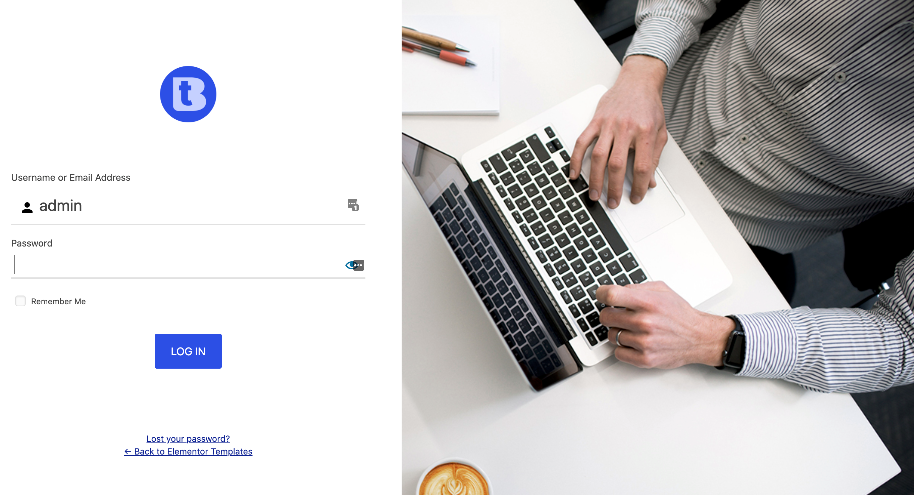
So while the login form may appear like the example below on a computer.

—
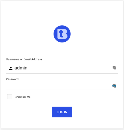
This same login page might be displayed with the form being featured more prominently on a mobile device (example: tablets and phones) since there is less space to work with. This is done in order for the fields to be accessed clearly and easily.

—
The WordPress Login Form Styling option in WishList Member has been developed to display effectively on many popular device sizes.
More general information regarding the styling of the WordPress login form can be found in the WordPress Login Form Styling Knowledge Base article.
